Ever picture how great your life would be with substantially more leads and sales?
Maybe it’s getting genuine kudos from the top brass?
Perhaps the envy of your co-workers?
Or is it just the personal satisfaction of knowing you’re a serious difference-maker in your line of work?
Most people don’t know about the following powerful, bottom-line increasing landing page techniques. And by most people, that includes Marketing Directors, CMOs, and CEOS.
You’ll find that if you use even half of these proven techniques, you’ll be way ahead of your competitors, and well on the road to Conversion Nirvana.
Usability = Not Thinking
In the popular web usability book by Steve Krug, “Don’t Make Me Think”, he brilliantly states:
“If something requires a large investment of time — or looks like it will — it’s less likely to be used.”
When designing for usability, everything should be painlessly obvious.
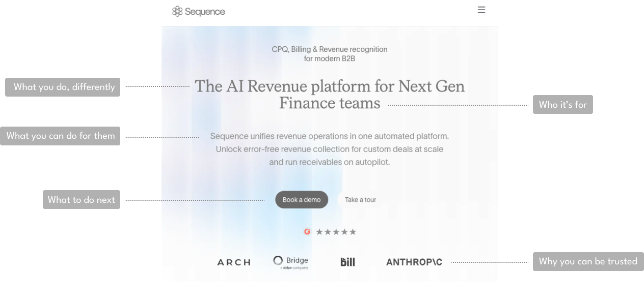
Your visitor should quickly and easily grasp:
- Who you are (and are you someone they can trust?)
- What you’re offering (is it valuable to them? How valuable?)
- Who’s it for (is it for them?)
- Why they need it (how it will make their life better?)
- How to get the offering
Don’t let them wander off
People get distracted easily. Eliminate navigation links to other pages. All your efforts should focus on leading your prospect to your conversion zone.
The conversion zone is the area where you want them to take action. The most common conversion zones are forms, “add to cart” or “buy” buttons, and “complete purchase” buttons.
You know your business too well
Have you ever heard of the term Organizational Blindness? When you sit and think about it, it’s really counterintuitive. With regards to your landing page, it means you know too much to be able to see things with a fresh perspective.
You have to be able to gauge the effectiveness of your landing page by testing it on someone who’s never been there or may have never even heard of your company or product. We’ll show you how to do that a little bit later.
SKIM > SCAN > READ
How people consume content
The way people consume web content is different from the way they read books. A book reader will usually read line by line. Whereas someone consuming written content online will skim the content first, then scan it, and then read it the way they would read a book.
Skim
The first action we normally take when visiting a website is to very quickly scroll down to get an idea of the contents of the page in its entirety and scroll back up to the top. If we decide that the page isn’t relevant to what we’re looking for, we’ll leave. If we decide to stay then we’ll come in for a closer look.
Scan
At this point, the visitor has decided that the content has the potential to answer their questions, provide insight, or help them solve a problem.
They’ll scan headlines, titles, bold words, key phrases, and images and decide preliminarily whether or not they add up to a satisfactory solution.
A great exercise to see if your page is highly scannable is to squint your eyes so that your vision is blurred. While doing this, be sure to take notice of what stands out and what doesn’t. We recommend that you use larger font sizes and bolding to allow visitors to take notice of important information on your page.
Read
At this point the visitor is fully committed to reading all of the content on your page because they don’t want to miss a single nugget of information.
Don’t drop the ball by boring them. Make sure your copy is well written, concise, and benefit driven.
Your copy should reflect your reader’s inner dialogue. When they’re reaching the end of a content section they’re asking themselves “What comes next?” Try to anticipate what they’re expecting and give it to them.
Thoughts and ideas represented in your copy should segue naturally to the next topic (instead of bouncing around), so the reader doesn’t get confused.
Use more value propositions to paint the picture of how your offer will improve their life. This will serve the answer to the question they’ll ask themselves several times while visiting your page. “What’s in it for me?”
Get a fresh POV (point of view)
You might remember how we spoke about organizational blindness.
In order to get a fresh perspective and valuable actionable insight, follow these 3 steps:
Step 1
Find a willing individual, such as a friend or family member to review your page. The less they know about your company, product, and offer, the better.
Step 2
Share your website with that person for about 5-10 seconds and then take the website away so they can’t see it.
Step 3
Now go ahead and ask that person these 3 questions:
- What is this page about?
- Is the offer good for you?
- If yes, what must you do to get the offer?
The best landing pages work to answer these questions within a few seconds and generally have a much higher conversion rate.
Usually, you won’t get feedback that completely matches your expectations for the page’s usability. In that case, you’ll want to go back and make some tweaks to the problem areas and test again with another person.
Use your Header
You’ll find that most landing page header areas contain a logo and (hopefully) no navigation. Not having navigation in your landing page header is considered a best practice and prevents the user from getting distracted.
The less distracted they are the more likely they are to stay on the page and convert.
Without any navigation to take up space, most landing page headers have tons of empty white space. It’s the perfect place to begin building trust and conveying authority.
If your brand is not particularly famous, you can quickly build authority by adding logos, seals, and certifications from associated, well-known companies, and associations.
For instance, if you are a partner of Microsoft, Adobe, or Hubspot, you can add their logo next to yours to give your brand instant credibility.
This also works with associations such as AARP, National Association of Realtors, or any other well-known association that you may be a member of. Just add the logo in the header area to build trust.
Adding important certifications also helps to convey authority to the people visiting your page.
Try adding a tool-tip to logos and seals. A tool-tip displays information about an image when the user hovers over them.
By providing information about the organization and your relationship with the association, you’re providing context to help the user understand that you’re someone they can trust.
Another great way to get people excited about your brand is to add media visibility to your header. You’ve probably been to a website that mentions “As Seen on TV”. It works wonders for building trust.
If you’ve had coverage in media outlets such as important news websites, cable networks, TV networks, magazines, TV shows, or movies, be sure to include the corresponding logos. Don’t forget to add the tool-tip for context.
Effective Imagery
Most of us are highly visually. 90% of the information transferred to the brain is visual. From an evolutionary standpoint, we’ve relied on our vision to assess danger, survey our surroundings, and understand concepts.
With regards to a landing page, using imagery is a powerful way to draw the user in. The trick is to use the right kind of imagery to maximize conversion.
How the brain processes images vs words
You’ve probably heard the saying “A picture is worth 1000 words”. In actuality, the human brain processes images 60,000 faster than words!
So yeah, images are very important because they’re going to have a huge impact on your website visitor’s frame of reference and internal dialogue.
Their asking themselves “What’s this about?” and they want an immediate answer. You don’t want to confuse them with the wrong kind of imagery.
Use imagery that explains what our offer is about
It’s important to have imagery that’s relevant. If your offer is a free whitepaper for how to solve major accounting problems, don’t display a picture of a doctor.
A photo of an accountant in a stereotypical working environment, along with an attractive image of the whitepaper, will go a long way.
I find it’s best to keep it simple and make the visual reference very obvious.
If you want to take it to another level, you can instead use images that represent the offer and the target audience, but with the “after” effect.
The “after” effect is simply what the user’s life will be like once their problem is solved. Conveniently aided by your whitepaper, demo, case study, product, or service.
Paint an emotional picture showing how their life will be better, if they accept your offering.
Trick for testing image effectiveness
If you want to gauge the effectiveness of your imagery try doing this…
Take one of your current landing pages and remove all the copy. Then, similar to what we mentioned earlier, get someone who isn’t familiar with your company, products or services to take a look.
Ask them if they know what your landing page is about. If they can tell you a fair amount about your offer and who it’s for, then it’s safe to say your image is effective. If not, we recommend using images that are more relevant.
You’re my Hero Image
It’s easy to get carried away if you’re a designer. Once your creativity juices get going you have to resist the urge to veer off track. Try to focus on using/producing the best performing images that make clear, relevant statements.
The hero shot is the primary image for your offer. It should enhance your main headline and quickly explain the benefits of your offer. Ideally you’ll want to show your target audience reaping the benefits provided by accepting your offer.
Big, well-known brands can get away with displaying vague, lifestyle themed hero images. They know that just by displaying their logo, visitors instantly gain context as to what the brand stands for, what the offer could be, and whether or not it’s for them.
So, unless you’re Apple, Adidas or Abercrombie, try sticking to relevant hero images that explain what your offer is about.
Headlines, What Works Every Time
Have you ever thought about how you read headlines? Believe it or not, most people skim headlines, just like they skim content on website pages.
First and last words
The first and last 2-3 words in a headline are the most important for conveying your message.
Why, you ask? Because heat map tests have shown that users focus their vision more on the beginning and end of a headline, as opposed to the middle.
It’s what their mind captures, comprehends and retains the most. Put all your important words at the beginning of a headline and at the end. And by important, I mean product names, benefits, call-to-action verbs, and high impact words.
Writing really short headlines negates this. Personally, I like to write short headlines. But many times, you’ll find that there’s too much information that you need to get across.
For longer headlines, that’s where the above technique comes in really handy.
Works on paragraphs and bullets
This works great for getting people to continue reading paragraphs. Great writers will put interesting phrases at the beginning and end of paragraphs. They give you the goods.
Take, for example, the paragraph you just read. I started with “This works great…” and ended with “…give you the goods”.
They’ve got only 1 Job – The Paradox Principle
There’s a psychological principle called the “paradox of choice”, explored by psychologist Barry Schwartz.
In his aptly named book, “The Paradox of Choice: Why More is Less”, Schwartz explains…
“Learning to choose is hard. Learning to choose well is harder. And learning to choose well in a world of unlimited possibilities is harder still, perhaps too hard.”
Basically, for most of us living in robust capitalistic societies, the amount of choices available are dizzying.
Think about all the different varieties of products at your local supermarket. Dozens of different kinds of cereals, laundry detergent, pasta, cold cuts, and canned goods.
You’ve pretty much nailed down your favorites in each category, but what if, for some strange reason, you’ve never been to a supermarket? You’d be pretty overwhelmed, right?
That feeling of it all being a bit too much to assimilate, kind of like how aliens, newly encountering earthly surroundings, are depicted in the movies.
That’s how many people feel when they first land on the majority of websites. Even if your landing page is effectively able to communicate who you are, what you’re offering, and what’s in it for them, you still need to give that alien visitor (the user) a mission.
Now they make think that they have a mission, usually to gather information in order to make an informed decision. You want them to do something for you.
They’ve only got 1 job to do. You choose what that 1 thing is, usually, in the case of B2B marketing, it’s to submit a form.
Aim for a 1:1 attention ratio
The attention ratio is the number of things a user can do versus the number of things they will do.
Home pages on average have a 50:1 attention ratio. Your home page usually has navigational links in the header, body, and footer. The user can choose to click any one of those links.
For your landing page, you’ll want to aim for a 1:1 attention ratio. Don’t give them any option other than the option that leads them to accomplish the mission you’ve set up for them.
We’ve already discussed removing navigational links earlier in this post. You’ll also want to refrain from multiple offerings.
Just 1 offer
I know it’s tempting to offer up all your goodies, such as your expert whitepaper, your case study, and your how-to guide, all on the same landing page. Doing that just causes confusion for your user.
By having too many choices they may not be able to make a decision about anything.
It’s recommended that you test 1 offer per landing page and test several landing pages to determine what converts best.
Remember, this is mostly science, supported by art (design). Scientists are very methodical and disciplined. The scientific method works well by isolating conditions and variables, then testing, analyzing, and applying learnings to improve results.
Improve your Form Conversions
Your form conversion zone is the place where all your efforts of persuasion lead to. Don’t drop the proverbial ball at this critical juncture.
It’s the area generally regarded as the “form”, which contains the actual form fields, along with vital elements, such as the call-to-action headline, additional benefits, and button.
Call to Action Headline
Your call-to-action headline is 1 of the 2 most important elements of your landing page, along with the main headline.
It should be about WHAT the user should do right now and WHY they should do it.
The Formula: What + Why
You’re going to get better conversions if you use this formula. Try to use concise language that clearly explains the WHAT & WHY.
Example:
Download Your Case Study: And learn how to save up to $3000/yr. on your electric bill.
What
Let’s break that down.
“Download Your Case Study” is the WHAT.
In other words, WHAT they need to do. Because, going back to the inner dialogue the user is having in their head, they’ve asked themselves “Ok, I want to do this, now WHAT DO I HAVE TO DO?”
Make it plain and simple, and always try to start with a verb, such as:
- Download
- Sign-up
- Subscribe
- Buy
- Get
Why
Most people think they only need to put the WHAT as their call-to-action headline.
They may have bought into what you’re offering, they may want it, and now they know how to get it.
But they can see now that they’re going to have to fill out a form to get it.
Do you like to fill out forms? Me neither. I don’t know anyone who does.
The thought of having to fill out a form stops most people in their tracks and the longer the form, the lower the conversion rate.
So, we have to keep moving the user towards the conversion. Reminding them of the WHY gives them another little push forward.
Here’s the full WHAT + WHY Example again:
Download Your Case Study: And learn how to save up to $3000/yr. on your electric bill.
The WHY:
“And learn how to save up to $3000/yr. on your electric bill”
In this case, you’re reminding them of why they need the offer, in a general sense.
Next up, you’ll want to put some frosting on that cake by adding a couple of solid benefits.
Add Benefit + Proof
Adding in these last couple of points can really help to increase conversions. You’ll want to add them right after your call-to-action headline and before your form fields start.
It can be broken down like this:
Benefit = how the offer will improve your life
Proof = the proof is in the offer
As an example:
Learn which appliances guzzle the most electricity, from a power company engineer.
The benefit is:
“Learn which appliances…” – here you’re telling them that they’re going to get the knowledge they’re looking for.
The proof is:
“…from a power company engineer” – this is telling them that it’s not Joe Schmoe’s advice they’re getting, it’s actually information from a professional authority.
Using WHY in your button text
If your WHY statement is attractive enough, you can even use it as your button text. Just be sure to test different button text, to see what works best.
Phone Usability
Depending on your vertical and your target audience, the majority of your visitors will be seeing your landing page on a mobile device.
You’ll want to make sure the landing page is responsive and looks great on mobile devices. Make sure that all your functionality stays intact.
Finger the culprit
Keep in mind that we’re using our fingers to scroll, swipe, pinch, zoom, and navigate on our phones.
That means that text links are difficult to navigate. It becomes even harder when several text links are lumped close together.
We recommend that if you absolutely must use multiple text links on your landing page’s mobile version, space out your links vertically.
Even better, try using buttons for important links. Bigger is better in this situation.
And going back to what we discussed earlier, try to limit the call-to-action to 1.
Meaning, try to use only 1 button on your landing page.
Drive traffic & test (fast)
It’s the cumulative benefit gained by using many of the tactics mentioned in this post, that will lead to a high percentage jump in your conversion rate.
So, let’s imagine that you’ve implemented many of the tactics outlined in this post and want to see how much better your landing page is converting?
Where are you going to get the traffic?
Traffic from your sources
If you’ve been running landing page campaigns in the past then you’re familiar with the sources of traffic you’re using.
We can say that traffic from internal/owned assets is the easiest way to get eyeballs in front of your landing page.
Some of the top internal traffic sources include:
- Your email lists
- Linking from pages on your site (or other sites you own)
- Email signatures
- PPC platforms
If you don’t have the internal traffic volume to properly test and optimize campaigns, we recommend running some pay-per-click campaigns.
Depending on your audience, Google and LinkedIn work well for testing how well your landing page converts.
A/B testing
There’s so much we can say about A/B testing, but we’ll keep it short for now.
To run an effective A/B test, there has to be a substantive difference between each landing page. You’re going to be testing 1 concept against another.
They should differ in regards to elements such as:
- Headline
- Hero image
- Offer appeal
- But always try to use the same offer in both versions being tested.
For example, if your offer is a white paper, offer the white paper in both versions of the A/B test. Don’t offer a white paper in one and a free demo in the other.
Keep it apple to apples.
After several tests, you’ll find a clear winner. Then you can move on to testing smaller elements like benefit bullets, call-to-action text, headline tweaks, and button colors, to squeeze out even more conversions!